So, my wife spent all day working on the cover art for my poetry book. She tried various methods and much cursing ensued. In the end, I gave her an unused moleskin notebook and she took her aggression out on it. Then she digitally put the title and author name on it. Unfortunately, there’s a white border around it, which might be an issue.
What do you think?

About Charles Yallowitz
Charles E. Yallowitz was born, raised, and educated in New York. Then he spent a few years in Florida, realized his fear of alligators, and moved back to the Empire State. When he isn't working hard on his epic fantasy stories, Charles can be found cooking or going on whatever adventure his son has planned for the day. 'Legends of Windemere' is his first series, but it certainly won't be his last.

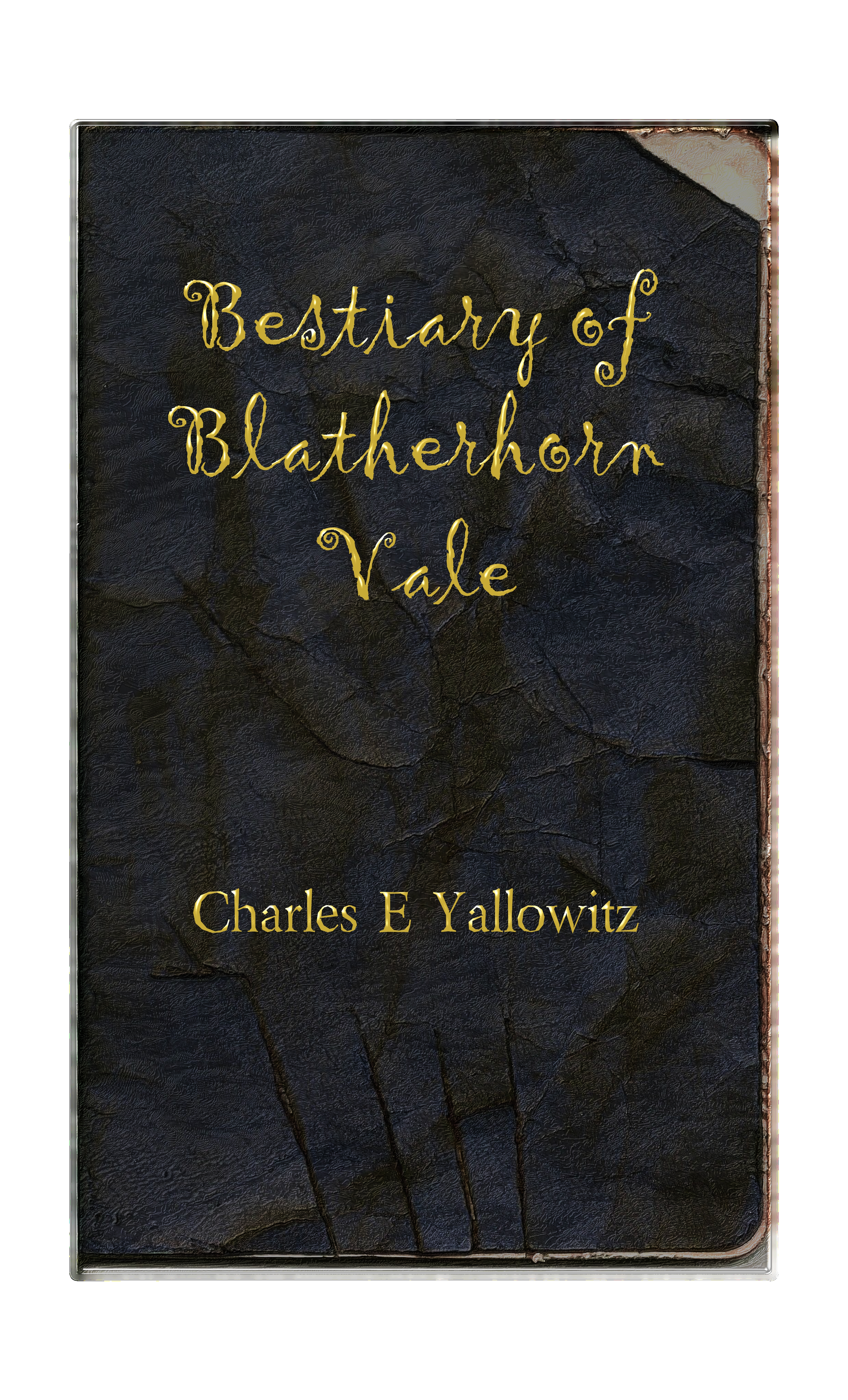


First thing I noticed right away is that the bottom looks like it has claw marks!! It looks awesome and as if the “beasts” have had their chance reading it!
LikeLike
That’s what we were going for. The book description talks about finding this journal like it’s been mauled. There are faint bite marks on the top right, but Tracy couldn’t get them to be clear.
LikeLike
Ditto!
LikeLike
I like it
LikeLike
Thanks. 😀
LikeLike
Love it, it puts me in mind of Edgar Allen Poe for some reason. 🙂
LikeLike
Thanks. My wife is gong to be happy to hear that.
LikeLike
I like it. I’m not 100% sold on the font for the title, but I did shrink it down to thumbnail size and it’s still legible. At full size it looks really good.
LikeLike
Thanks. We’re going to look at other fonts and see if we can find better in the program. Any font recommendations or style ideas?
LikeLike
If you’re going with a handwritten style, I would suggest something more like a draftsman lettering. I do like the font on your name–Times New Roman? For my covers I used TNR and then manually stretched all the uprights to make them out of proportion, I thought that struck a good balance between legibility and originality. The problem with e-book covers is that they are usually seen first in thumbnail, and if it’s not instantly clear, the cover is likely to get passed over.
The distressed leather is awesome. Kudos to your wife/graphic designer.
LikeLike
We’ll do a few tests in thumbnail size to see if anything works better. We ran into that problem with the bookmarks. Looked great at large size and then looked terrible at normal size. We didn’t notice until they were printed and on the convention table. Thanks.
Funny story about the distressed leather is that she spent an hour or two trying to make it look right on the scene. Then she fond the embossed leather and start laughing like she lost her mind. Now we have to figure out what to do with the sacrificed notebook.
LikeLike
Love it. Looks like it was carried around by Luke during his adventures.
LikeLike
Thanks. The owner of this manual was not as lucky as Luke. They’re still looking for him, but we’re pretty sure he was eaten. 😉
LikeLike
I like it Charles…it appeals to the eye,,, kudos to you and your significant other it is a real good design…
LikeLike
Thanks. I’m surprised the combination of physical and digital worked so well.
LikeLike
Love it Charles! Looks awesome! 🙂
LikeLike
Thanks. And the wife is dancing with happiness at the compliment.
LikeLike
I like this very, very much! Your wife did an awesome job!
LikeLike
Thanks. I’ll let her know.
LikeLike
Even with the border, it looks appropriately archaic; fantastic. It seems magical somehow. Sir, I want to hold this book in my hands. That is a very lovely cover. It’s appealing to the fantasy lover in me. Very nicely done! 🙂 Your wife definitely has skills.
LikeLike
Thanks. I’m glad we decided to go for a physical cover to pummel and then put the words on digitally. Actually, I’m surprised it worked out so well. I’m still deciding on if I want to put this in paperback form too.
LikeLike
Nice! Well, if you do, I’m sure it’ll be pretty dope.
LikeLike
Checking it out now to see how it looks.
LikeLike
Oh and my wife is ecstatic that you liked it. She’s bowing and saying ‘thank you very much’. 😀
LikeLike
Aww, shucks, well, it’s the least I could say and what I could say hardly captures what I really feel looking at the cover. The closest feeling I get is reminiscent of the first time I ever opened a fantasy novel (probably the best feeling I ever had, with regard to books), which, I believe, was the “Elfstones of Shannara” (read those out of order). When you get your book out (and my financial situation is straight), I’m going to be sure to get a copy, most definitely. Here’s to excellent design and excellent writing. You two rock!
LikeLike
Thanks. Apparently, once I start on Createspace and get passed the ISBN, I might as well go for the long haul. I’m hoping this thing isn’t going to be too pricey in terms of paperback. I have to go 8.5 x 11 again if I can’t figure out this formatting. Though, that would allow me to go for a cheaper price like it did with the novel.
It’s going to be a lot of fun to see how I do with poetry and go low advertising.
LikeLike
Ah, this looks fan-bloody-tastic, Charles!
LikeLike
Blood. That’s what we forgot to put on there. Though, that might have gone too far and had the same results as the ‘slime’. Big mess.
LikeLike
Reblogged this on The Arkside of Thought | Poetry, Philosophy, Politics & Life and commented:
Just my opinion, but I think it turned out famously. It just works. Check it out, people! Charles new book cover, courtesy of his wife!
LikeLike
It’s gorgeous Charles! Definitely worth the frustration that went into it. Please congratulate your wife on a job well done!
LikeLike
Thanks. I’ll let her know.
LikeLike
I like it very much, good work.
LikeLike
Thanks. Sounds like it’s a major success. Can’t wait to post the book live.
LikeLike
I like it! I’m a little critical of the font, maybe something a little less swirly to make it easier on the eyes? And maybe emboss it, just to give it a little boost on that “ancient” style?
LikeLike
We’re going to see what we can do. We’re having trouble finding a font that is still readable at the thumbnail size. Worse case scenario is I use this cover and we fix up the font on a new edition when we can find something else.
LikeLike
Well done! I’m not as critical of the font as everyone else. It isn’t perfect, but I think you’re on the right track. Something simpler, but not modern…check into a font from the early days of typesetting, something with serifs. That might work better. Regardless, this is great.
LikeLike
Thanks. We’ll see if we can find something like that.
LikeLike
Oh wow, Charles! This is great! Your wife did a fantastic job here!
Ellespeth
LikeLike
Thanks. We’re going to see if we can find a better font for the title to make it more ‘archaic’ and less flashy. So far nothing has caught our eye.
LikeLike
I really do like the cover. It is awesome how talented of an artist your wife is 🙂
LikeLike
It really is. She’s looking into opening an Etsy store, which I hope will work out.
LikeLike
First of all let me tell you ts a great thing living in an artistic family!Your little one will be one of the happiest children in the world!Annd e cover is great!It seems done on purpose!Well done!
LikeLike
Sorry for the spelling! I sent the comment from the mobile!!!!
LikeLike
No problem. Blame autocorrect. 😉
Glad you liked the cover. I’m sure my son will enjoy being in an artistic family. So far he loves painting. One of these days I hope he paints on the paper we give him instead of his shirt.
LikeLike
😀
LikeLike
I like it. I like it very much.
LikeLike
Thanks. 😀
LikeLike
I really like it however i’m not sold on the font. Otherwise fantastic!
LikeLike
The font seems to be a sticking point for a lot of people. We’re hoping to change it this morning, but we’re having trouble finding some that fits the theme and can be read clearly as a thumbnail. I’m hoping to get it in the ‘In Process’ stage by 10, so it may be ready to announce before I go to bed.
LikeLike
Wow! That looks frikkin’ fantastic Charles! Wife did a great job! 🙂
LikeLike
Thanks. I’ll relay the message. We had to tweak the final product for Amazon, but overall I think it worked. Though, I have no idea what to do with this decimated notebook. I’m thinking a souvenir.
LikeLike
Ace! *bows to Mrs Yallowitz’ It looks great, as though it has been mauled by one of the monsters likely to be described therein, a wonderul concept and great result, congratulations to you both, kind regards, kind regards, baldy 🙂
LikeLike
Thanks. Glad the ‘mauled’ look came out right. My wife almost went overboard trying to find a way to mark the cover from each of the 40 monsters. She’s still a little down that she couldn’t add fake slime to the cover.
LikeLike
it looks great the way it is, enticing, I know that I am keen to look within (though not until I am wearing the appropriate armour).
LikeLike
Just have to keep your distance and not make any sudden movements. Though armor would help. Tank-level armor to be safe. 😉
LikeLike