
Yeah. I know this contradicts my last post, but I’m not heading out for a few hours. This is probably going to be a little late in coming too because I’m setting up everything at 10 AM before I head out.
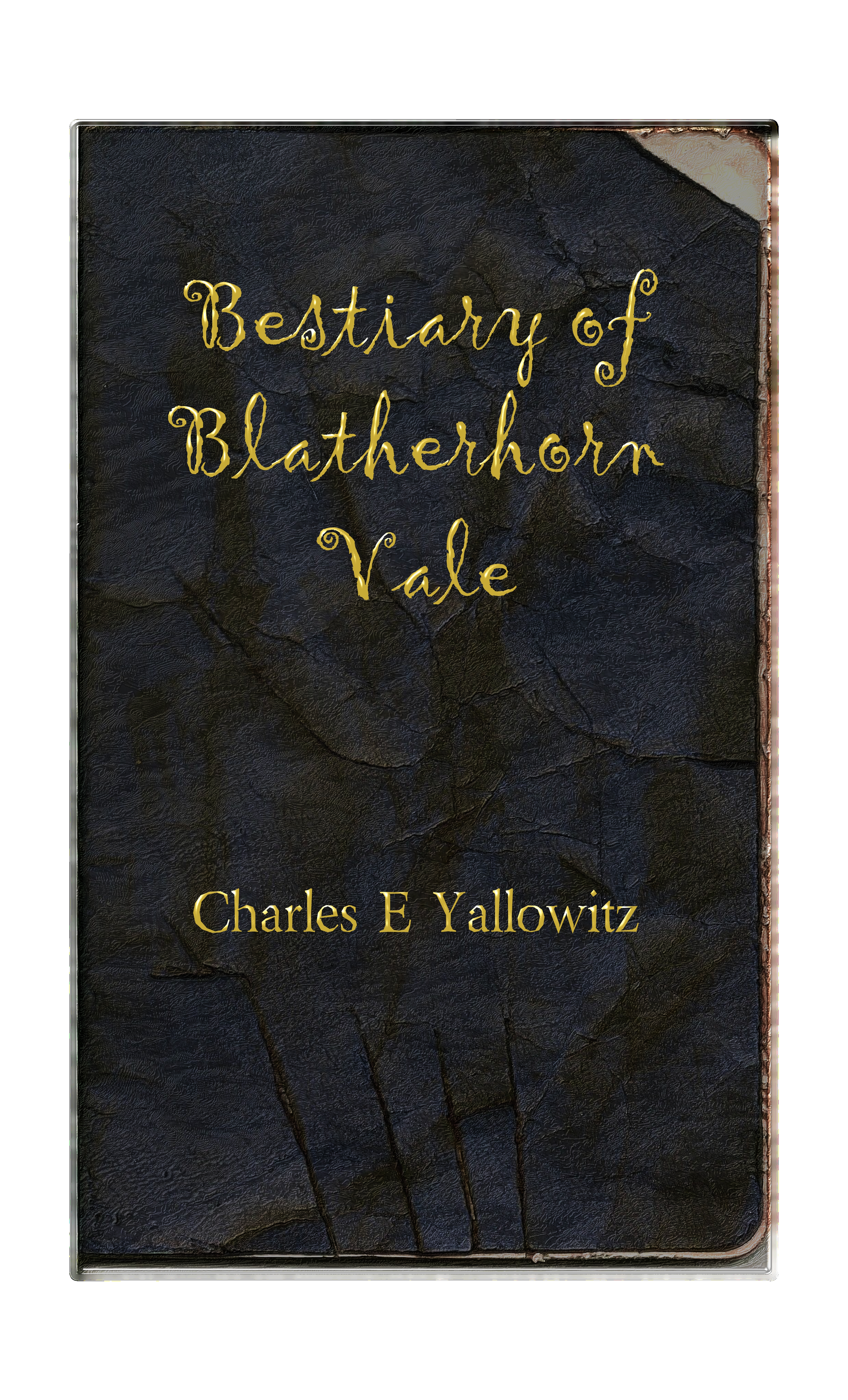
Personally, I don’t think it’s as eye-catching and looks too clean for a book that was written in the wild and eventually mauled. That’s just my opinion. So, let me know what you think. Is this one better than the last? I can always switch covers at some point, so now I just to figure out which one to start with.


Charles could you post the previous cover in this one to better compare? From what I remember I liked the previous cover slightly better.
LikeLike
Done. I’m getting a lot of thumbs up for this one too. It’s going to be a tough call.
LikeLike
Well the first the newer is definitely clearer to read. But I really like the original. What font is that btw? It looks to me more interesting and fun.
LikeLike
Gigi font. Looks like we’re going to have to figure something out to handle the Amazon conversion destruction. Might have to be a very bland cover if we can’t pull anything off.
LikeLike
The other one is more interesting as artwork, but I think this one is better as a book cover. Yes, it lacks the handwritten feel of the other one, but I think the gold letters on the distressed leather works very well. And it’s much clearer as a thumbnail. I’d go with this one.
For the trade paperback did you use white as the background color or fill that in with black?
LikeLike
White. That’s the only option I saw when I did it. The paperback is going to have the original for a little while because I had to set it up last night to make the Memorial Day deadline.
There’s always that hard decision for me between practicality and cool art. I just added the old one for a comparison too.
LikeLike
Fair enough. CreateSpace actually has some pretty versatile cover options, but you have to sort of dig for them. If you want I’d be happy to help you. I’d also suggest doing a back cover in the same style, if you haven’t already.
LikeLike
Might put a back cover on at a later date. I’m not concerning myself too much with the paperback right now because the eBook will be the main event at the beginning. Amazon’s conversion tore the cover apart because of the leather filter. So, we just want to get it done and ready to go now.
LikeLike
Hmm. I like the font of the previous cover better. It has an Old World feel to it like you’ve stumbled upon a forgotten book on ancient wisdom. The other seems too modern for the title but that’s just my opinion.
LikeLike
I’ve been hearing that from people I e-mailed both covers to this morning.
LikeLike
The first one you posted is waaaaay better. It has a feel to it that matches the title.
LikeLike
Thanks. Hopefully it still looks better after all the retooling that we have to do. Looks great on my blog, but the Amazon conversion tore it apart.
LikeLike
I like the second one better. The crazy, curly font just gives it an edge of the fantastic. Umm … I would try making the font a little larger on the title, just to see how it looks — I think you could get away with it, and hey, the bigger the title, the easier it is to read, right?
LikeLike
Thanks. I sent it in at 10:30, but we’ll see if we can improve the cover after it comes out. Amazon conversion forced us to take what we could get. Didn’t realize the title was so small. Then again, we had to resize everything on the new version that went in. So, for all I know it’s a bigger size.
LikeLike
I honestly prefer the onld one, but it’s just my taste! And I’ve just nominated you for the Versatile Blogger Award here http://frannychallenge.wordpress.com/2013/05/26/other-blog-awards-thanks/
LikeLike
Thanks for the feedback and the award. 😀
LikeLike
;D
LikeLike
I like the first one you posted better too, though both are fine. 🙂 🙂
LikeLike
Thanks. 😀
LikeLike
Thanks. Glad you liked it.
LikeLike