Here’s a new version. Let me and Dean know what you think.
By Dean Kealy
About Charles Yallowitz
Charles E. Yallowitz was born, raised, and educated in New York. Then he spent a few years in Florida, realized his fear of alligators, and moved back to the Empire State. When he isn't working hard on his epic fantasy stories, Charles can be found cooking or going on whatever adventure his son has planned for the day. 'Legends of Windemere' is his first series, but it certainly won't be his last.


I like this better. The title is more prominent.
LikeLike
Cool. Be nice to have this saved and ready to go by the end of the weekend. Will take a lot of pressure for a Halloween release off in case the third book takes a bit longer.
LikeLike
If I don’t start reading, I will never get Prodigy finished. Only 40% done. Really good so far though
LikeLike
Good to hear you like it. I always wonder where the percentages are though.
LikeLike
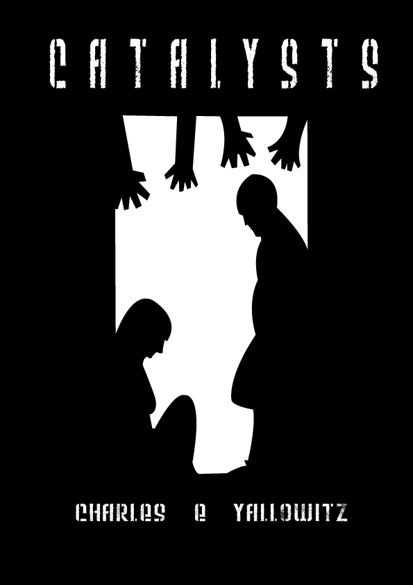
It brings out a feeling of fear and claustrophobia in the simple picture.
LikeLike
Perfect. 🙂
LikeLike
Reblogged this on Dean'z Doodlez and commented:
So here’s a new version of the cover to Charles’ Novella “Catalysts”. The cover is by myself. What do you think?
LikeLike
There is still some lettering errors, like the positioning of title (there is more space at left then at right). The picture also looks kinda thined, stretched atm.
LikeLike
We’ll see what we can do on that.
LikeLike
It looks really sharp in the thumbnail. The size shown here is a bit rough. Are you going to be doing print, or just e-book?
LikeLike
I’m thinking of strict e-book since it’s a novella. I’d set up a paperback if there’s a big enough request.
LikeLike
I’d redo it for a print cover. As a thumbnail for an e-book, it’s beautiful. Go live with it.
LikeLike
Thanks. Holding for a Halloween release. Guess that’s a tad stereotypical though, but this is another experiment and for fun.
LikeLike
It looks unique, and definitely grabs my attention. No problem with contrast. I like the title font, but it does make your name difficult to read. The chopped fingers: I’m wondering whether readers will be more critical that they don’t look right than award style/artistic points; I’d probably make them more natural to be safe. My main concern is the degree that this may speak horror, both the image and the font. The hands seem to show this, but is that enough? I think the stronger it quickly signifies the genre, the better. Overall, I really do like the style. 🙂
LikeLike
Thanks. We’ll see what we can do with the technology at our disposal.
LikeLike
Your earlier cover had a lot more white, this one has thick black borders on the right and left. I wonder how a compromise might come out; maybe, widen the white horizontally a bit. (No idea if it would be better. Mostly, I’m just curious.)
LikeLike
Not sure. Honestly, I’m liking the black to give a sense of the elevator shaft and isolation, but it could be too much. Tool around with it for a bit and see what happens. It’s a novella in a genre I’ve never written in before, so I’m not sure how much oomph I should give it. Another experiment, I guess.
LikeLike
Give it the best oomph you can (at least, without adding oomph to your investment) and you’ll get the best results of your experiment. You have a following, and you may get a little cross-over between genres from readers who like one of your books. I don’t usually read horror, but even I’m interested. Good luck with it. 🙂
LikeLike
I’m aiming for a blog blitz and a few free things. I won’t go crazy like I do with my novels because of funds. A lot of places don’t promote horror too.
LikeLike
I like this one. I agree that the book title being bigger is a great thing.
LikeLike
Thanks. 🙂
LikeLike
Much better title!!! I think someone mentioned it above, but the central image does seem a bit narrow – maybe widen it a bit? Then I think you’ve got it! 🙂
LikeLike
We’re going to try. It is an elevator, so I don’t know if that changes things.
LikeLike
I like the lettering.
LikeLike
Thanks. 🙂
LikeLike
I really like this. I like the simple silhouettes and the font/lettering is much better. As for the image, this takes place in an elevator. Those aren’t known for being big. It could be widened a little, maybe, but the narrowness also works well for atmosphere, I think.
LikeLike
Thanks, person I don’t know.
LikeLike
I love the cover and also I really like the font that was used, well done.
LikeLike
Thanks. 🙂
LikeLike
This cover is great, Charles.
LikeLike
Thanks. Can’t wait for the release.
LikeLike
Wow! This is really cool looking!!!
LikeLike
Glad to hear. 🙂
LikeLike
Yes, this is very intriguing and makes me want to click on it to see what the story’s about. It’s harsh and dark. If that’s what you’re going for, you nailed it.
LikeLike
Thanks. That was the intent. 🙂
LikeLike