
Two things!
One is that I put up the first 3 chapters of Legends of Windemere: Beginning of a Hero on Wattpad. It is a growing iOS app or something that my friend just told me about. It’s simple, but it can help get short stories, novellas, and excerpts out. So, I hope this gets a little more attention even though I probably won’t remember to check the thing too often.
The second is that my wife re-did the bookmark using Inkscape as suggested by Michelle Proulx. Thank you and let us know how the new version is:
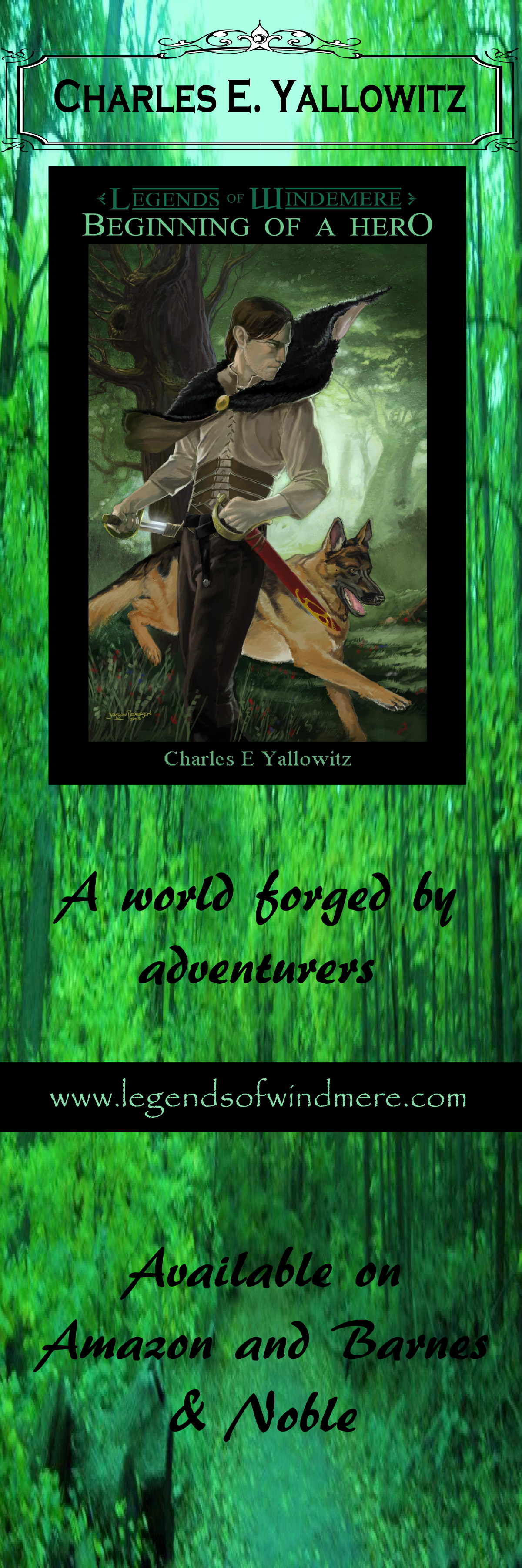
Funny, I thought the lettering was going to be gold. Going to have to bring that one up with her.
Edit change: Alternate lettering color.
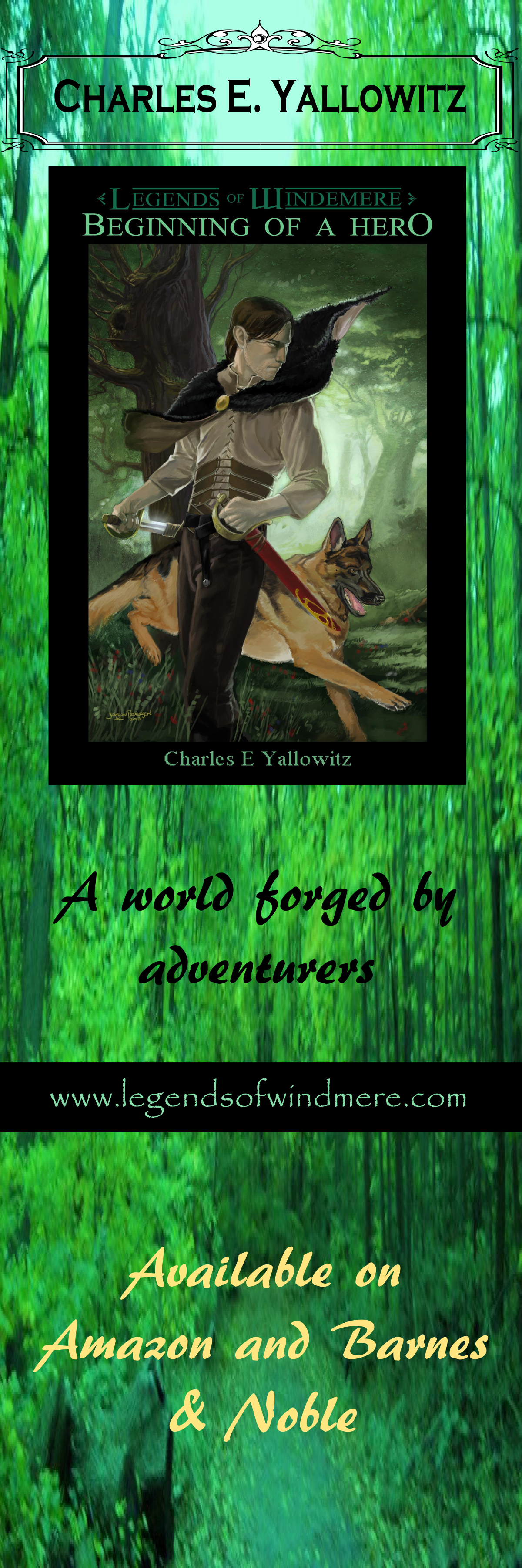


I think black lettering shows up better than gold would – IMHO
LikeLike
I’m more concerned about the bottom area where the right hand side seems to blend into the forest.
LikeLike
The right hand side of the lettering does seem to blend into the forest a little, but it is by no means unreadable. I like the redesign, I think it looks really good.
LikeLike
Thanks. I wonder if it will look clearer when printed out and it’s just the way it looks on a computer.
LikeLike
I like the gold better, but I can barely see the legends of Windermere in green above the picture, maybe it is just my eyes.
LikeLike
Thanks. It’s not your eyes. The Legends of Windemere at the top of the picture is part of the cover art. It’s hard to see on a computer, so we’re hoping it looks clearer when printed out.
LikeLike
I like the bottom one… and it’s green! So of course I love it! 🙂
LikeLike
Thanks. 🙂
LikeLike
Either black or gold look fine – the whole thing looks fantastic though – just beautiful in its own right! I think how cool it would be to be reading your book and using the boomark as you do so…genius! 🙂
LikeLike
Love the first one! Green is absolutely beautiful!
LikeLike
Thanks. It fits the character more too.
LikeLike
Love it! I definitely prefer the gold. And does your wife know about the “Filters”? There’s a drop-down Filter menu with a “Shadows and Glows” option — you can give your text a “drop glow” or “drop shadow” that will make it stand out more from the background and give it a 3D effect.
LikeLike
I’ll suggest it. The basement where the computer is was freezing yesterday, so she had to retreat after getting so far. I’m not sure how advanced she was going for this, but we’ll probably have to print it out by the end of the weekend. Two weeks from today, I’ll be behind a table handing out CD’s, bookmarks, and (hopefully) stickers at my first convention. Also, revisiting the old college stomping grounds, which is an added bonus.
LikeLike
Woo! That convention sounds like so much fun. Have a blast, and good luck with book sales 😀
LikeLike
Thanks. It’s going to be a small, simple convention with a bunch of friends. I’m hoping the 100 CD’s are enough to get me through the event. I was told that it isn’t too big even after all these years. Maybe I’ll get lucky and an old professor will stumble into me.
LikeLike
Pingback: Rome Crew Update – Issue # 7 | Green Embers
Looks great!
LikeLike
Thanks. Now for the joy of printing it.
LikeLike