
Here is the cover made by Dean Kealy of Deanz Doodlez. Please let us know how this looks, so we can adjust. Is the cover creepy? Are the title and author name clear enough?
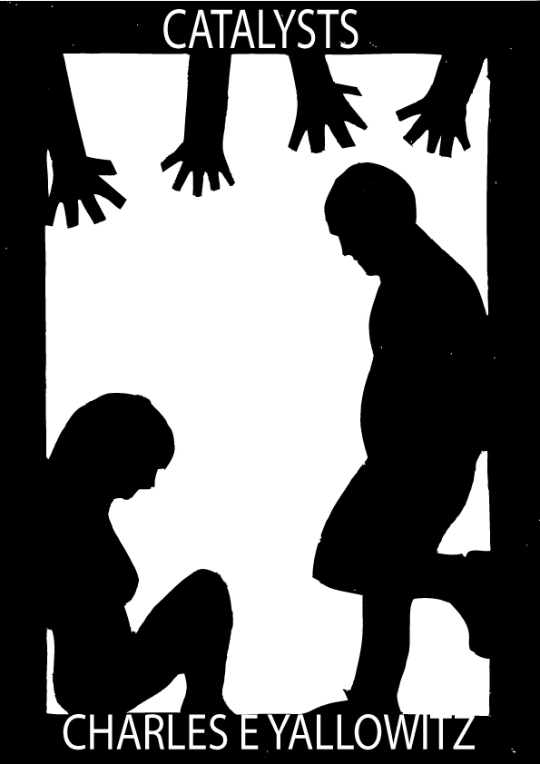
Cover by Dean Kealy
I also worked a bit on the blurb and realized one act could fix some of the problems people mentioned. Less is more here. Let me know what you think:
“When trapped in an elevator together, Jeffrey and Darla learn that misery doesn’t always love company. With the screams of death and chaos echoing from outside, they find themselves slowly slipping into a world of fear and darkness they may never recover from. All the while, something is terrorizing the convention outside and turning the guests and celebrities into psychotic monsters.”
I’m going with the Horror and Occult/Supernatural categories because nothing in Thriller seemed to fit. I know those are big categories that my little novella might get lost in, but I can’t see where else I would put them.
Does anyone have suggestions for the 7 keywords? I don’t know what’s popular to use in this genre. Any help would be appreciated.


Reblogged this on Dean'z Doodlez and commented:
Check out Charles’ new Novella in which I’m illustrating the cover! 😀
LikeLike
I am in NO WAY an author or an artist so what I say may not count..lol. I think the name and title are clear enough. I don’t know much about your book except what is posted here, but here are my initial reactions. I do like the cover. It has a feel of two people that are secluded from, but very near danger. They feel it reaching for them, that they are very close to death. The only thing that struck me as a tiny bit out of place is the very relaxed position of the man. He looks a little more bored than scared. I think it’s the foot up on the wall that gives me that impression. This is just my 2 cents worth, and it might not even be worth that much!
LikeLike
Thanks. We were going for depressed or waiting for the inevitable, but I can see bored. Honestly, the opinion of non-author/artist’s is a boon because that’s the target audience. Everything here is what will be seen on the Amazon sale page, so it’s good to hear people being honest about how the blurb and cover work together.
LikeLike
I didn’t think about it as depressed, but that would work for that. I was fixated on scared for some reason. Oh or maybe resignation! I really can see it as that! So, if that is what you are going for, I say it is spot on!
LikeLike
The two characters aren’t really aware of the danger and are trapped, so resignation sounds like a great thing to go for. Almost like they’re waiting to be let out into the chaos outside, so it’s a lose/lose situation.
LikeLike
The cover art is definitely creepy — I would actually say distort the figures even more so they look even less human for maximum creep factor! As for the author name and title … I mean, I can definitely read them just fine, but compared to the creepy factor of the art, the words seem kind of … well, boring? Maybe that’s just me, though. I like my fonts bold and threatening 🙂
LikeLike
Maybe make the words a little ghostly and slanted? A distortion of the hands would be really cool since those aren’t exactly human.
LikeLike
Ahhh I’m not much of a graphic designer, lol. What if you made the top and bottom borders a bit larger, so you had more room to play around with the text? Or put the title within the image itself? Like, cramped between the two figures or something? I don’t know, lol. Definitely distorted hands would look cool 🙂
LikeLike
Not sure the title cramped with the characters would work. That seems too crowded. Making the black borders bigger for more wiggle room might work. Dean knows more about this than me, so he’ll have a better idea.
LikeLike
Seems the hands can’t be made hazy without the people becoming blurred too.
LikeLike
Very cool looking cover!
LikeLike
Thanks. 🙂
LikeLike
The last two letters in the author name ,, TZ ” are a bit lost in the white background I think.If you can just move down a bit the name.Just a thought.
And congratulations.
LikeLike
Thanks. Was wondering about that.
LikeLike
I like the idea of a bigger border to allow more room for the title and author. I’m not wild about the hands. It doesn’t really speak to me. In fact at first I thought they were upside down trees 😉
But I like the boldness of the black/white and clean lines.
LikeLike
Posting a new one in an hour or so. Dean fixed up a lot. Couldn’t get the hands looking different, but they’re not supposed to be human. Hoping we can get away with it.
LikeLike
I found it extremely creepy, but not for your intended reason, I’m afraid. I was surprised when I read your description, though I can see the intent in the cover now, but my initial impression remains. One look at the cover and I concluded that she had been beaten into submission and he’s so cruel that he’s acting casual about it. The hands above suggested those seeking to help her. We all bring our own baggage, I suppose, but that’s still the only way I can interpret his casual, superior pose and her huddled, submissive pose.
LikeLike
That’s definitely a unique take on it. This is a gory horror, but I can see how you took it as a story of abuse.
LikeLike
It’s still a great (and very creepy) design. If no one else took it the way I did then go with it. Good luck with the book!
LikeLike
The idea behind the artwork and concept is very good but the letter/picture arrangement needs some work.
LikeLike
Thanks. Just posted an updated one about 15 minutes again, so hope that shows improvement.
LikeLike
Gonna check it out:)
LikeLike
I saw the revised cover first… The name is clearer on this one. 🙂
LikeLike
You’re right, less is more. The brief blurb is perfect, and makes me want to know more about this bizarre scenario.
LikeLike
Great to hear. Fingers crossed this does well.
LikeLike